Write usability test tasks as scenarios, not instructions
How to write usability test tasks: give participants a goal, not a click path. The UI words in your task quietly turn a navigation test into a reading test.
Published July 16, 2026
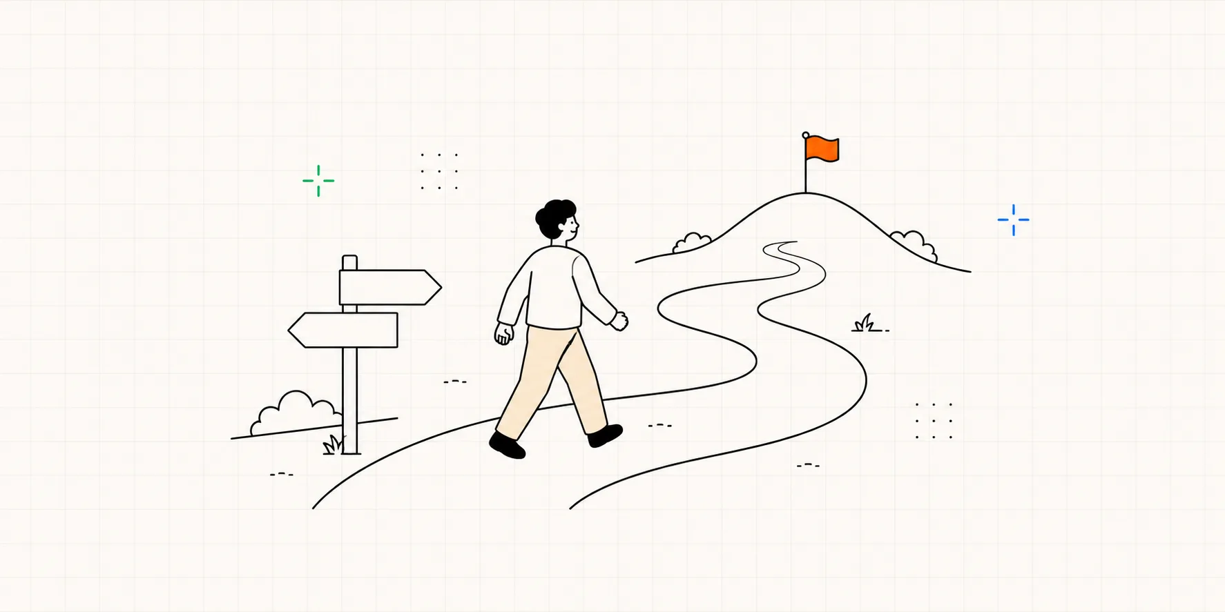
You hand the participant a task card: "Click Sign up and create an account." They read it, click the big Sign up button, fill in the form, and finish. You write "success" in your notes. And you've learned nothing.
The task should hand over a goal, not instructions
A good usability task gives the participant a goal. Describe a situation they'd recognize and the outcome they want, then let them find their own way there.
The failure mode is almost always the same: the task sentence names something on the screen, a button, a menu, a feature, so the participant just matches the word and clicks it. You meant to test whether they could find sign-up; instead you tested whether they can read.
Writing tasks is step two of running a usability test, and getting the wording wrong contaminates every observation after it.
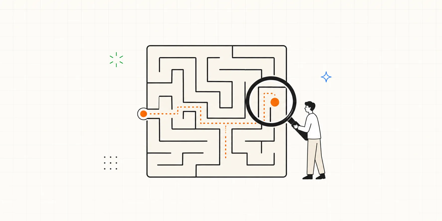
Instructions test reading. Scenarios test your product.
An instruction tells the participant what to do; a scenario gives them a reason to figure it out. As NN/g puts it, a task scenario "situates requests within context" and gives the person a motivation for why they're acting. With a motive in hand, they engage with the interface the way a real user would.
| Instruction | Scenario | |
|---|---|---|
| What it gives | The steps to follow | A goal and a reason to reach it |
| What the participant does | Matches your words to the screen | Works out their own path |
| What you learn | Whether they can read | Whether your design works |
| Example | "Tap Filters, set price under $50, apply" | "You've got about $50 to spend. Narrow this down to what you can afford." |
The leading-word trap
Here's the single mistake that breaks the most tests. When a word in your task also appears as a label in your interface, you've already handed over the answer. In NN/g's words: if words from the interface appear in your task, "you're priming your participants and testing their reading comprehension and ability to find matching words, rather than your labels and navigation." A finding task shrinks into a matching task.
Say you want to know whether people can locate the export feature. The task reads "Export this report as a PDF." If the button says Export, the whole task collapses into "find the word Export." Rewrite it as the goal instead: "You want to email this report to a coworker who doesn't have an account. Get it into a form you could attach to an email."
There's one exception. Some words are just how ordinary people talk, like "search." If finding the search box isn't what you're testing, naming search may be fine. But if you want to know whether people can find it on their own, don't say it. When in doubt, leave it out.
Six tasks, before and after
The fastest way to internalize this is to see it across products. Same rule every time: name the goal and leave the button out.
Ecommerce
- Bad: "Click 'Add to Cart' and buy the black running shoes."
- Why it fails: You named the button and picked the product, so there's no decision left to observe.
- Fixed: "You want to start running this spring and need a pair of shoes, ideally under $60. Find a pair you'd actually buy."
B2B setup
- Bad: "Open Settings, go to Integrations, and connect Slack."
- Why it fails: That's the click path spelled out. You'll never learn whether anyone can find Integrations on their own.
- Fixed: "You want your team to get a Slack message every time a deal closes. Set that up."
Mobile app
- Bad: "Tap the menu icon and turn on Dark Mode."
- Why it fails: It names the control and the destination. For anyone who can't find the menu, the task just told them where it is.
- Fixed: "The screen's too bright for you at night. Make it easier on your eyes."
Signup form
- Bad: "Fill in the signup form and hit Submit."
- Why it fails: No goal, no motivation, and "Submit" is a UI label. All that's left to measure is typing speed.
- Fixed: "A friend recommended this app and you want to try it. Get yourself to the point where you can actually start using it."
Banking
- Bad: "Find a branch near you and see when it opens tomorrow."
- Why it fails: "Branch" is probably the site's own word, and "find a branch" points straight at the feature. (This is close to NN/g's own example of the trap.)
- Fixed: "You need to visit the bank tomorrow. When does the location most convenient to you open?"
Booking
- Bad: "Use the calendar to book the 10am slot."
- Why it fails: "Calendar" and "slot" name the UI, and "10am" removes the one real decision left.
- Fixed: "Book the earliest morning appointment you can get next week."
How to write your own, in two lines
Write each task in two lines:
- The setup: one line of context that gives them a motive. "You're planning a weekend trip..."
- The goal: what "done" looks like, in their words, with one real constraint. "...find a place to stay for two nights under $150."
Before the session, strip these words out of every task:
- Button and link labels (Submit, Add to Cart, Continue)
- Menu, tab, and screen names (Settings, Integrations, Dashboard)
- Feature names you invented (Smart Sync, Quick Share)
- Marketing phrases ("our powerful new...")
- The steps themselves ("first go to..., then click...")
If a task still reads like a manual, ask yourself one question: would a real person, in real life, ever say this to themselves? If not, rewrite it as the thing they'd actually want.
If keeping all this straight by hand gets tedious, an AI can help. Interbang comes with scenario drafting and review prompts that bake in these exact rules. Ask for a first draft, or bring tasks you've already written in line with the rules.
Now the rest is just watching
Once your tasks read like scenarios, the session itself gets simpler. You give one goal, then stay quiet and watch. Set up each use case and its tasks in advance, and during the session you're just observing and timestamping notes instead of managing paperwork.
And staying quiet is harder than it sounds. What helps when a participant freezes, and what quietly turns into a leading question, are skills of their own, and they're what moderating a session comes down to.
Frequently asked questions
Should a task ever include an interface word? Rarely. The exception is a word that's also how ordinary people talk and isn't what you're testing, like "search." If you're checking whether people can find the search box, don't name it. If search is just the means to a goal you care about, it's usually fine. When in doubt, leave it out.
Won't a vague scenario just confuse participants? A scenario is specific about the goal and silent about the path. "Find a place to stay for two nights under $150" is concrete. What you remove is the path, not the goal, and you still give them enough context to make real decisions.
How long should a task be? One or two sentences. Enough to set a motive and a clear finish line. NN/g cautions that heavy backstory can add complexity to a task that should be simple, so cut any scenario detail that doesn't help the person decide.
How many tasks per session? Enough to cover your goals without wearing people out. For a 30 to 60 minute moderated session, a handful of well-written tasks usually beats a long checklist. Order them the way a real person would run into them.