The test is over. Now what do you do with all these notes?
How to analyze usability test results in three steps: pool your notes, cluster them into patterns, and rank what to fix by severity and frequency.
Published July 17, 2026
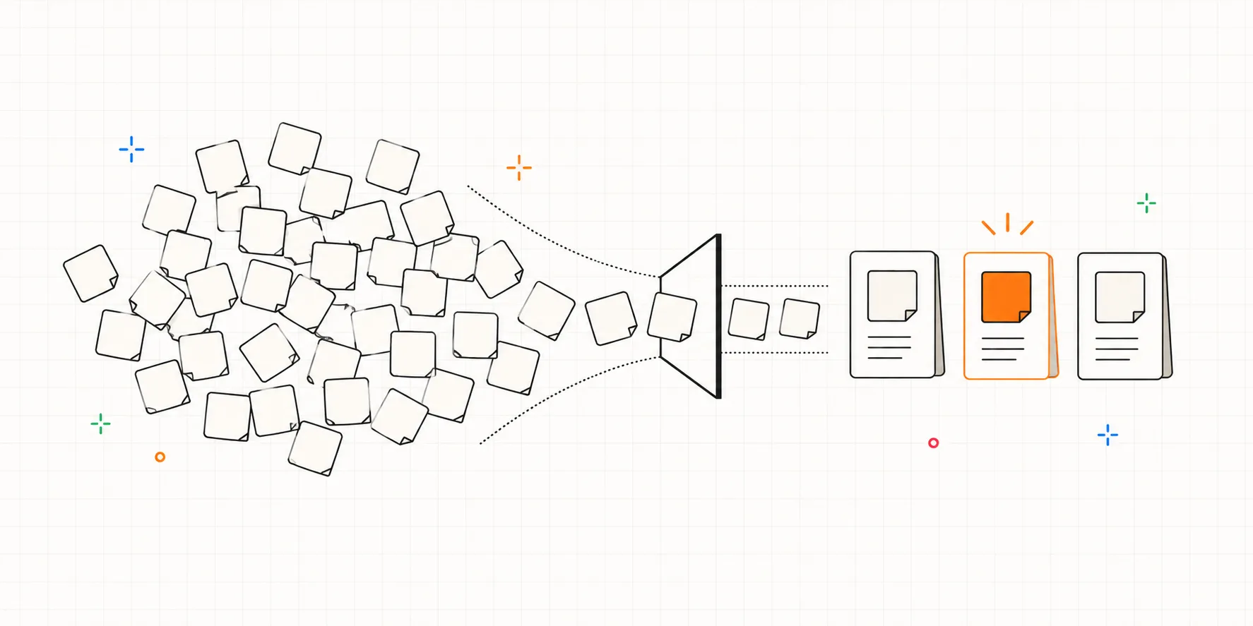
The last participant waves goodbye and the call ends. Five sessions have left behind 104 notes, a few screenshots, and 3 hours 48 minutes of recordings. Tomorrow your lead will ask "so, what did we learn?" You watched every session yourself, yet all that comes to mind is a handful of moments where someone got stuck. You learned a lot, surely. It's just all unsorted.
How to analyze usability test results in three steps
Analyzing usability test results comes down to three moves: pool every observation in one place, cluster the pile into patterns, and rank the patterns by severity and frequency. The method is tool-neutral. It works on a wall of sticky notes, in a spreadsheet, or in a research tool. And the goal is not a ten-page report. It's a short list, three problems or so, each with evidence attached, that your team will actually fix.
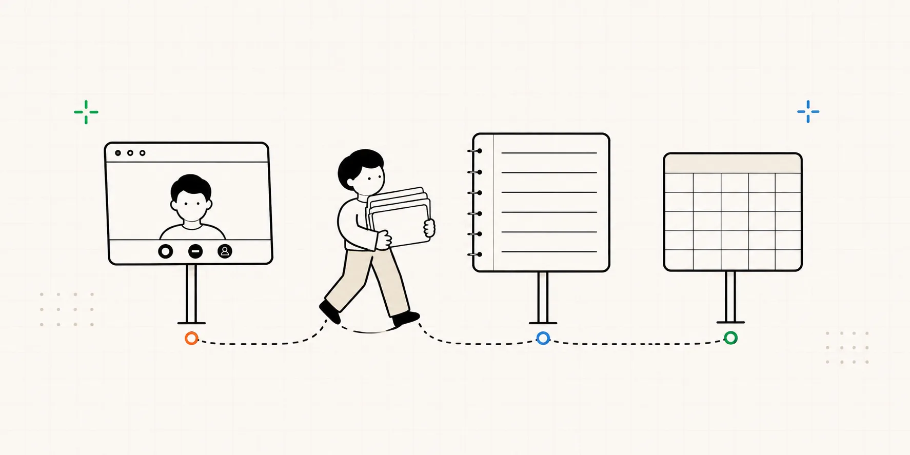
The three steps take an afternoon for a typical five-session study. Here's each one.
Step 1: One pile, one observation per note
First, get everything into a single pile: session notes, quotes, moments from the transcript, anything you marked during the sessions. NN/g describes this stage as collecting the observations and quotes that speak to your research questions, and it comes with a warning: not every data point deserves equal weight. Something you watched a participant do counts for more than an opinion they volunteered. "Participant 3 clicked the wrong tab twice" is evidence; "Participant 3 thinks the design is clean" is a mood.
Keep each note to one observation, and keep the who and the when attached. "Participant 2, minute 12: typed a teammate's email into the search bar" can be traced back and defended later; "people were confused about inviting" can't. If your notes were timestamped during the sessions, this step is mostly already done.
Step 2: Cluster the pile into patterns
Now the classic move: affinity mapping. Spread the notes out, then group the ones that describe the same underlying behavior. NN/g's version of the exercise runs in exactly this order, generate notes, cluster them into themes, then prioritize the clusters, and it works just as well solo in a spreadsheet as it does with a team at a whiteboard.
Two rules make the clusters worth having:
- Cluster by what people did. "Settings-page notes" is just a folder. "People look for invite in three different places" is a finding, even though those notes came from three screens.
- Name each cluster as a claim with a count. Not "invite issues" but "4 of 5 participants couldn't find how to invite a teammate." The name should survive being pasted into Slack on its own. A small count doesn't make a cluster less important; the count is information you consult alongside severity in the next step.
If your notes already carry a type tag, this step gets easier: split observations from problems, insights, and bugs up front, and you can set the opinions and bug reports aside and cluster only the behavior.
A hundred notes usually collapse into something like a dozen patterns. Some will be big, some will be two lonely notes about the logo. That's fine. After this step, scattered moments have turned into claims you can argue for.
Step 3: Rank by severity, then frequency
Not all twelve patterns deserve a sprint ticket; they need an order. Jakob Nielsen's severity scale is the standard, rating each problem 0 to 4 on three factors taken together: how hard it is to recover from, whether it keeps happening once users know about it, and how often it occurs.
| Rating | Meaning | What to do |
|---|---|---|
| 0 | Not actually a usability problem | Drop it |
| 1 | Cosmetic; doesn't slow the task | Fix if there's spare time |
| 2 | Minor; slows users down a little | Low priority |
| 3 | Major; seriously gets in the way | High priority |
| 4 | Catastrophe: blocks the task entirely | Fix before anything ships |
Nielsen's rating already folds frequency in, but at a five-participant scale it's easier to keep two separate axes, how crippling the problem is crossed with how many people hit it:
| Hard to recover from | Easy to recover from | |
|---|---|---|
| Most participants | Fix now | Quick polish |
| One or two | Fix next, watch it in the next round | Backlog |
One caution on the numbers: with five participants, frequency is a compass, not a measurement. "4 of 5" tells you the problem is real and common; it doesn't tell you 80% of your users will hit it. (Why small-sample numbers still point the right way is covered in how many participants you actually need.) Severity is the tiebreaker: a catastrophe one person hit outranks a cosmetic glitch everyone noticed.
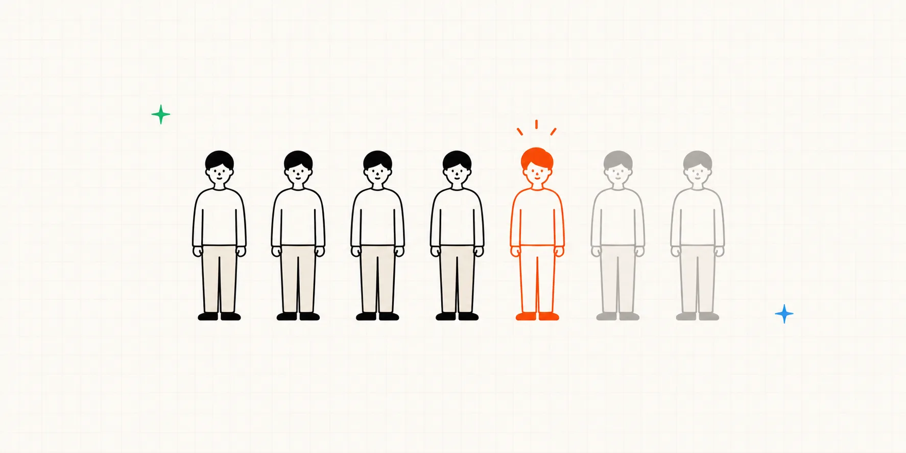
What this looks like in practice
Say you tested a project tool's onboarding across five sessions and ended up with 104 notes. While sorting, you keep seeing notes that come from different screens but point at the same behavior:
| Note | Screen |
|---|---|
| Participant 1 (min 3): circled the main screen twice, "I figured there'd be an invite button" | Main |
| Participant 2 (min 12): typed a teammate's email into the search bar, "I guess it's here?" | Main search |
| Participant 4 (min 7): opened Settings looking for invite, backed out twice | Settings |
| Participant 5 (min 9): gave up, "I'll just Slack people a link" | Member list |
All four failed to find how to invite a teammate. Sorted by screen these notes would sit in three different folders; grouped by behavior they become one finding: "Inviting teammates is invisible from the main screen" (4 of 5). Since every one of them stalled for minutes or quit, the severity is 3.
Keep going and you end up with 11 patterns. Now rate each one and count who hit it:
| Cluster | Severity · Hit by | Priority |
|---|---|---|
| Going back during onboarding wipes what you typed | 4 · 1 of 5 | #1 |
| Inviting teammates is invisible from the main screen | 3 · 4 of 5 | #2 |
| After setup, no clue what to do next | 3 · 3 of 5 | #3 |
| The other eight (wording, layout) | 1-2 · 1-3 of 5 | Backlog |
The result is three problems, each with clear evidence, so you don't have to win stakeholders over with words alone.
The heavy lifting is optional
That's the whole method, and it runs without any dedicated tool. But look back and half the sorting was decided while the notes were being taken: one observation per note, the who and the when attached, a type tag on each. In Interbang, every note you write is timestamped and linked to that moment in the transcript automatically, and you tag it as you type, so none of that prep needs a second thought. By the time the session ends, step 1 is already done.
You can also ask an AI for a first-pass clustering, and here too the material is half the battle. Dump raw notes and a full transcript on it and you mostly burn time and tokens for a mushy answer. Hand it notes that carry their time, tag, and evidence, bundled into a single Markdown, and the draft patterns come back far sharper. Then you just pick what to keep and what to drop.
Share three things, not ten pages
The report is where insights usually go to die, so keep it small enough to be read:
- The top problems, each stated as the cluster name, with severity, count, and one or two verbatim quotes as evidence.
- One or two things that worked. It builds trust in the method and stops the team from "fixing" something healthy.
- What happens next: which fixes go in, and when you'll retest. A usability test earns its keep when the loop closes, test, fix, test again.
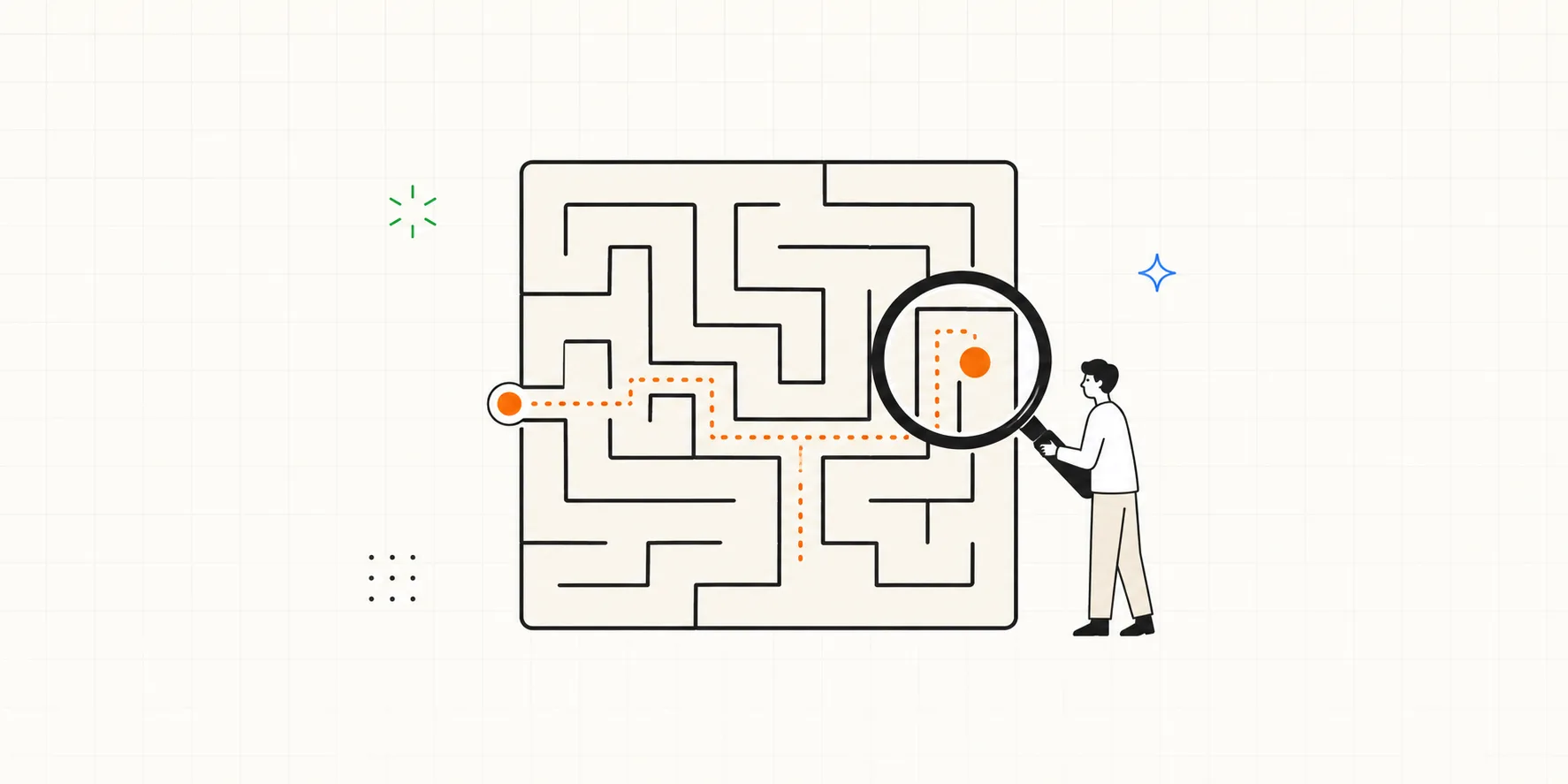
That third item quietly raises the next question: when you run the second round, how will you show things actually got better? That's a piece of its own.
Frequently asked questions
How soon after the sessions should I do this? Within a day or two, while the sessions are still vivid. Notes go cold surprisingly fast, and a note like "Participant 4 struggled here" is only useful while you still remember what "here" meant. Booking the analysis afternoon when you book the sessions is the easiest way to protect it.
What if only one participant hit a problem? Check severity before frequency. If it blocks a task or loses data, one sighting is enough to act on. If it's minor, park it in the backlog and watch whether it reappears next round. Frequency with five participants is directional, so let severity and impact make the call.
What does the deliverable actually look like? One page is enough: three or four prioritized problems with their evidence, one or two things that worked, and next steps (which fixes go in, and when you'll retest). If you need a longer appendix for stakeholders, link the full cluster list, but never make the one-pager depend on it.